Resamplr sound library
Background
I began working on Resamplr (or at least the foundations) around Senior year in High School. Since I was little, I always loved to create music digitally. I'd often use digitally "sampled" instruments to add some vibrancy to my tracks. As I grew older, I began to sample instruments of my own, including experiments like homemade instruments and strange combinations like bowed guitars. I shared these instruments with the internet, and the response was great.
Rev 1 (2014)
In high school, I began to create my own custom website for the sounds I made. I had brief encounters with WordPress and Wix, but in the end they proved too cumbersome for my use case. I learned some PHP and HTML, and came up with the above. This whole post is supposed to show my personal progress when it comes to design and interaction. So let's start critiquing and improving.
Rev 2 (2016)
A year or so later, I came back with some new skills. I learned how to create full stack web applications through my job with iCanCode Club. I took my design knowledge from college and began applying that to my new layout.
User Flow
I began by defining a high-level user flow that would describe the site's interactions. Being a commerce site, the site stays close to with what most users are comfortable.
Additionally, I mapped the all-important checkout flow. Although it's fairly basic, I did make sure to reduce friction as much as possible. The greatest risk to smaller e-commerce sites is a complex, annoying, or time consuming sign-up process. I mitigated this by allowing users to add items to their cart as a guest. The site then will prompt them to create an account upon checkout.
This is important, as users feel more invested in creating an account after spending time adding items to a cart. If the site asked for an account first, less users would feel compelled to buy anything.
Look and feel
I kept the brand simplistic, flat, and professional. I wanted to create a system that allowed me to feature content and have design fade to the back (similar to what one would want with a photography portfolio.)
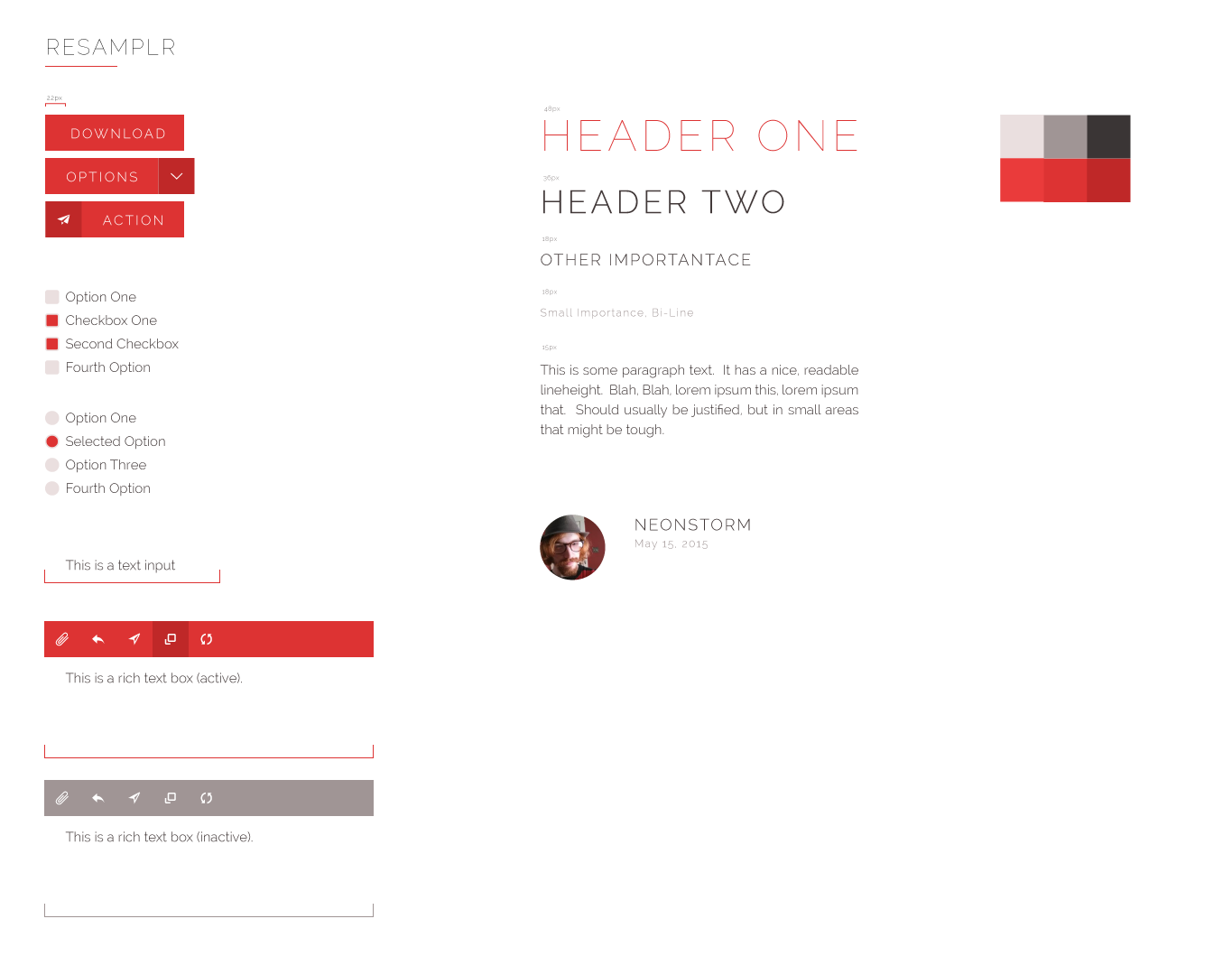
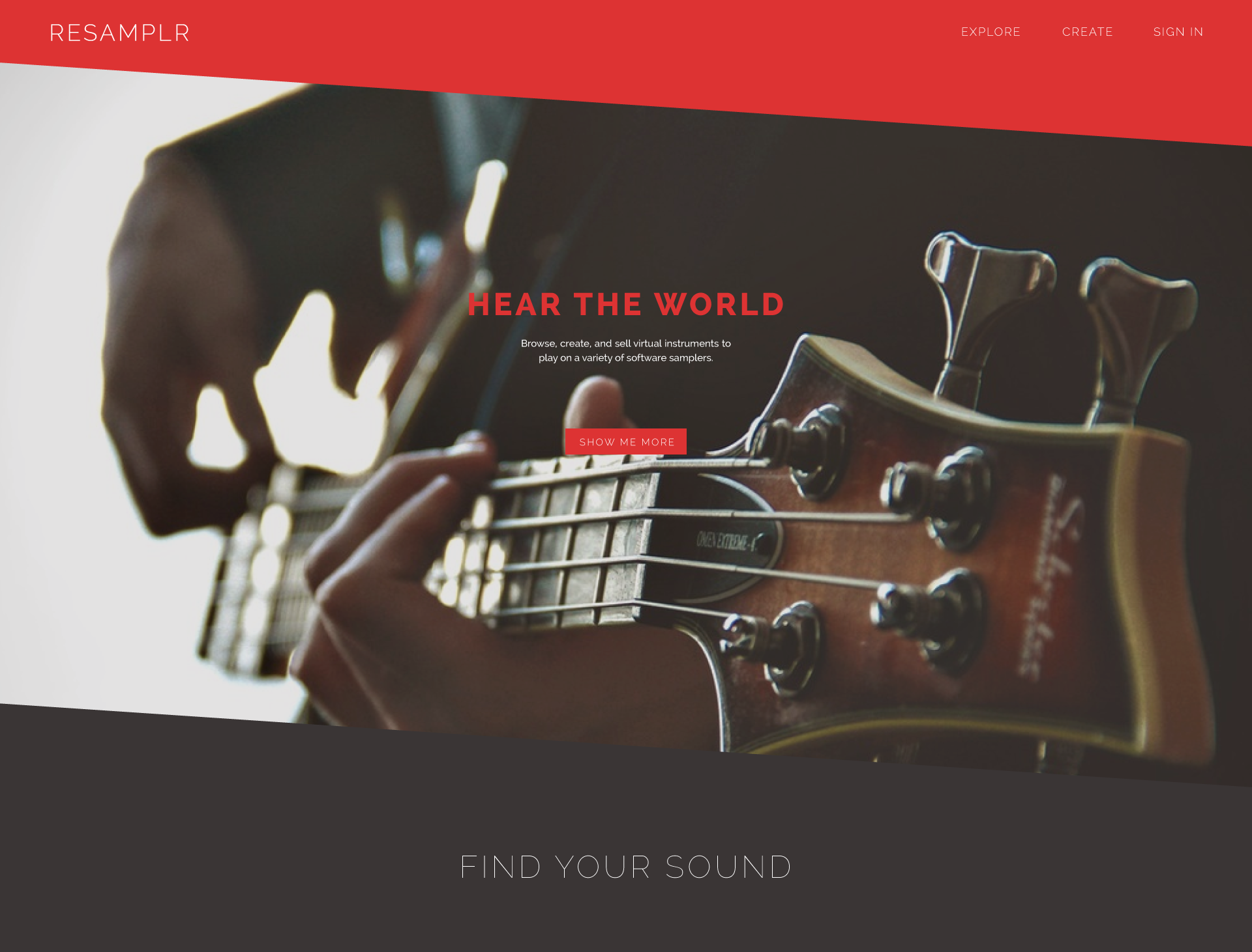
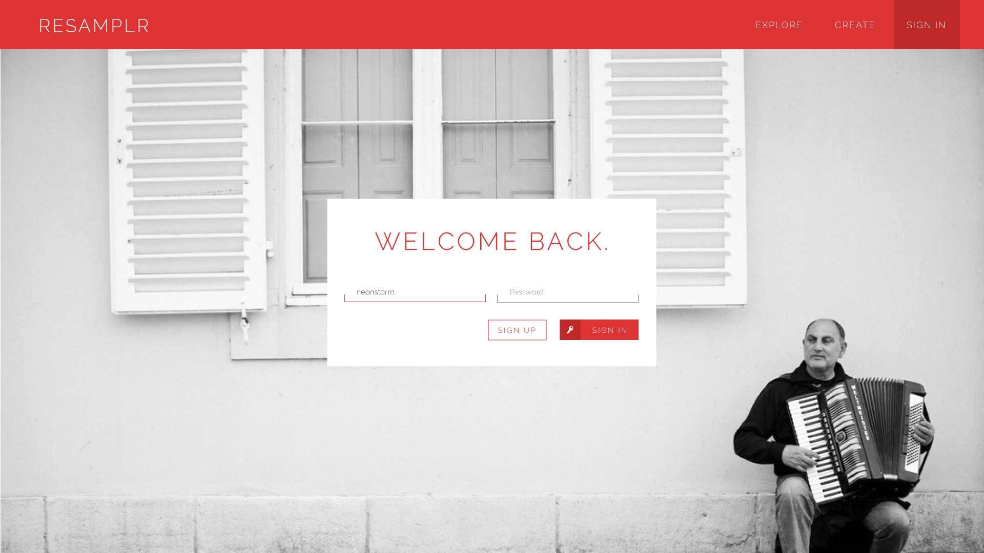
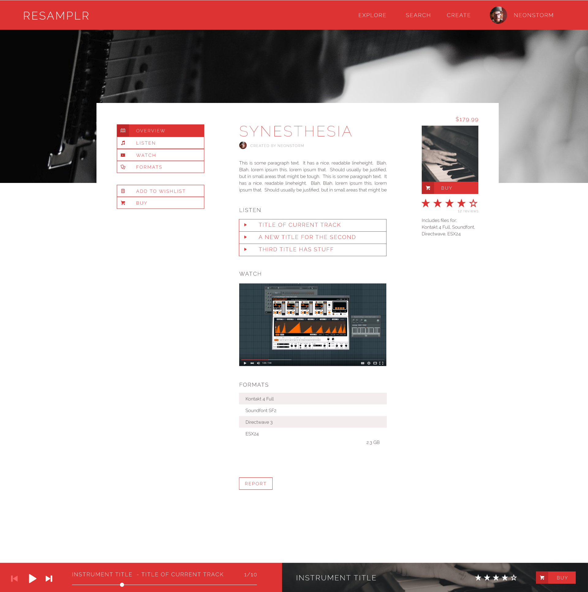
You can see how much I progressed with portions, typography, and color with this revision compared to my pre-college experiments. But as my friend Jack put it, It's boring. Music is a fundamental aspect of human creativity, and our design should reflect that!
I also began to realize that the majority of my customers were younger hobbyists, not professionals. This audience was looking more towards a relatable brand. My corporate look didn't convey that.
Rev 3 (2018)
Instead of looking at audio websites this time, I started my search with graphics and styles that fit the design language.
- Be Personal. Don't be corporate. Consumer should feel as though they always come first.
- Be Friendly. Don't over-complicate interactions. Rewarding users with unique interactions is great, but it shouldn't be overdone.
- Be Modern. Don't overuse imagery, borders, or other elements that can contribute to visual noise. This isn't a photography website, so make sure that images all contribute to the audio product being sold.
- Be Dynamic. After all, we're artists.
The main objective is to provide a different and better experience for all users - an experience that is easier, more intuitive, cleaner, and more developer-friendly than competitors.
Designing for Sound
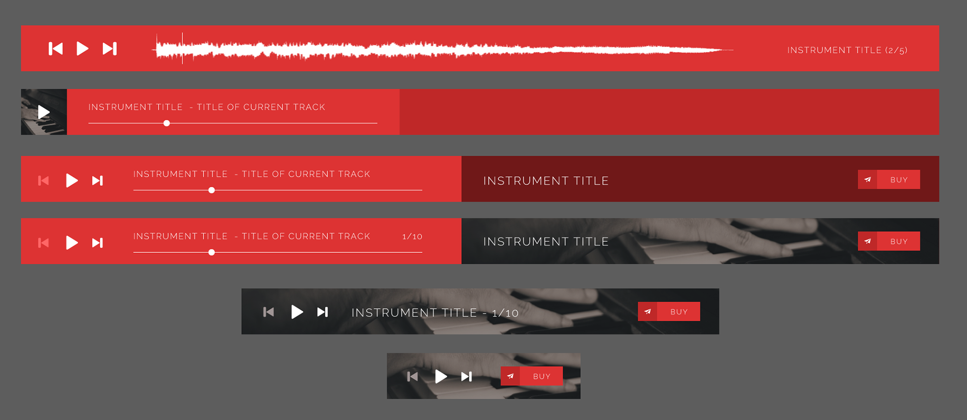
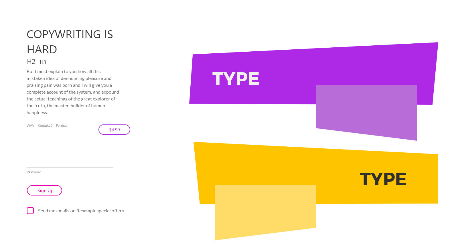
To start, I use complementary colors and angular accents. I am partly inspired by Jazz-era graphics with bold colors and trapezoidal shapes, as well as how the complementary colors "buzzed" similarly to sound waves. I keep UI elements simple, and typefaces utilitarian. While the injection of color and style is great, it shouldn't shout over the main attraction, which is audio.
Putting it together
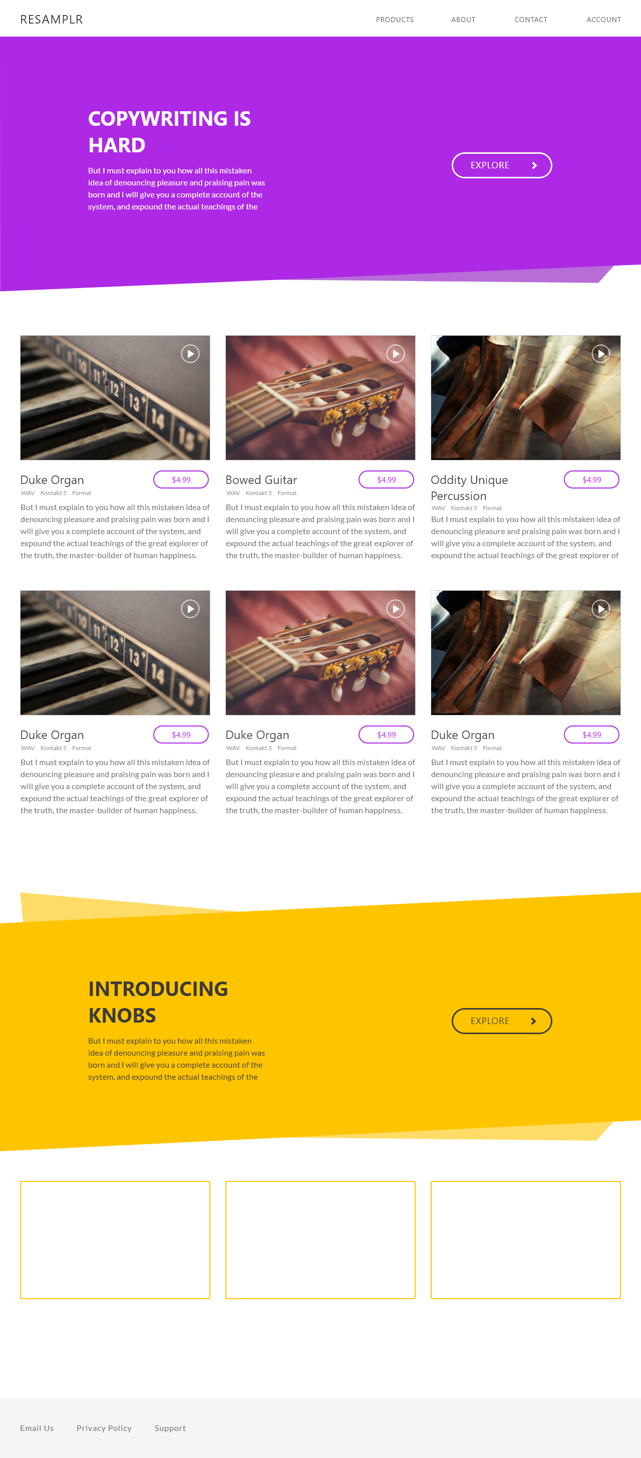
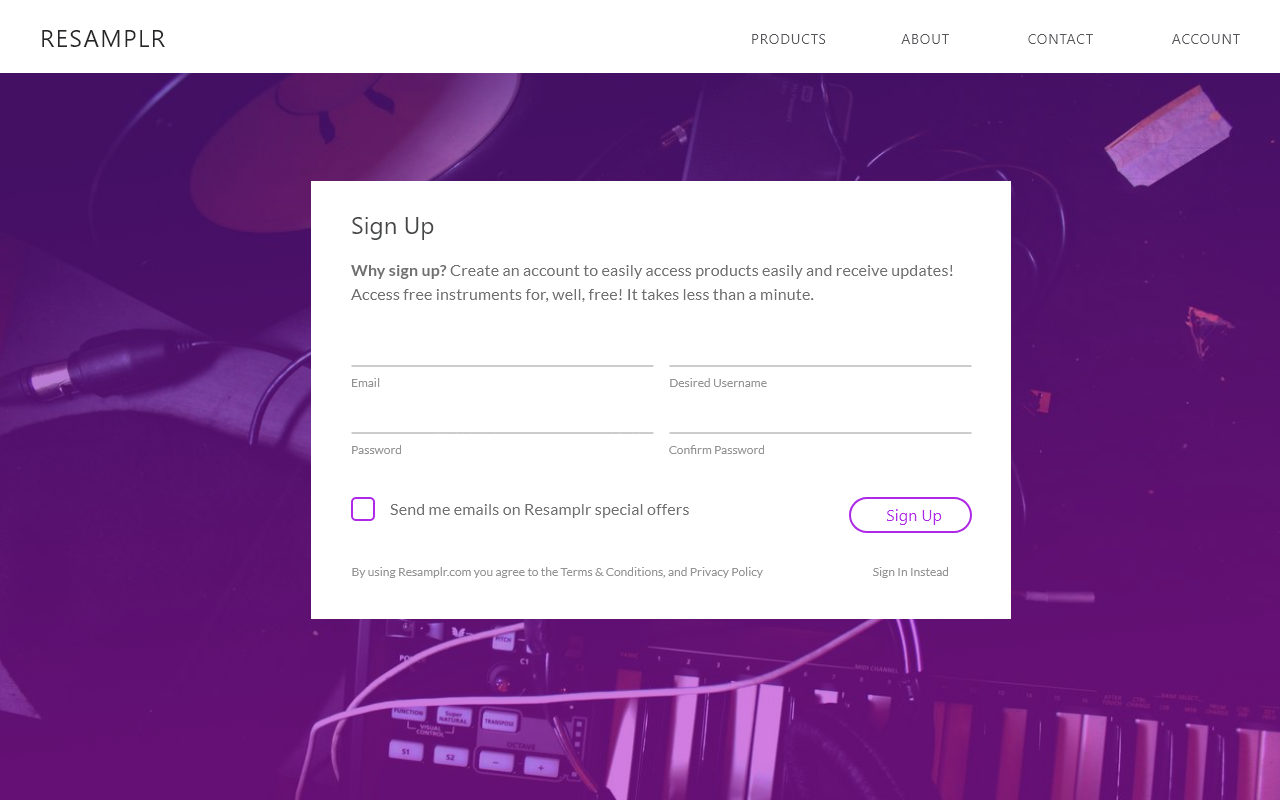
With these ideas in mind, I created mockups.
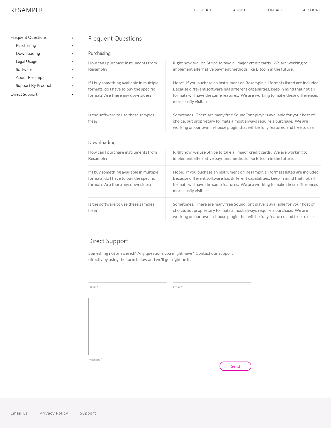
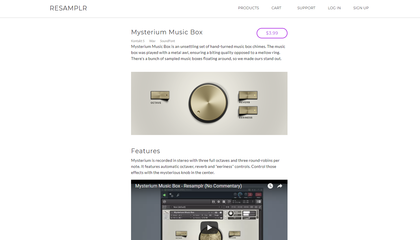
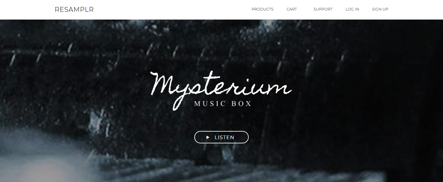
Creating it
So, what else is there to do but make it? Resamplr is live unfortunately due to hosting costs it has been taken offline. I used Rails 5 and traditional HTML/CSS for the current implementation.
I'm working to transfer the Rails project into a custom Rust based server with Elm as the frontend choice. You can see my progress here.
In the future, I would use a static site instead of a full server. It was a great project to learn from, but costs would be more manageable on a static platform.