The Reel: Sports Highlights
Intro
This is student work. Making a portfolio of your own work can be trying, especially when deciding what to include. Instead of removing this older work, I've gone through and added commentary on things I'd do differently and what I've learned since. If you're a designer and happened to check out this page, maybe some of these cases can be useful.
Wireframes
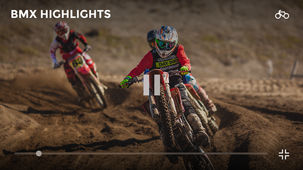
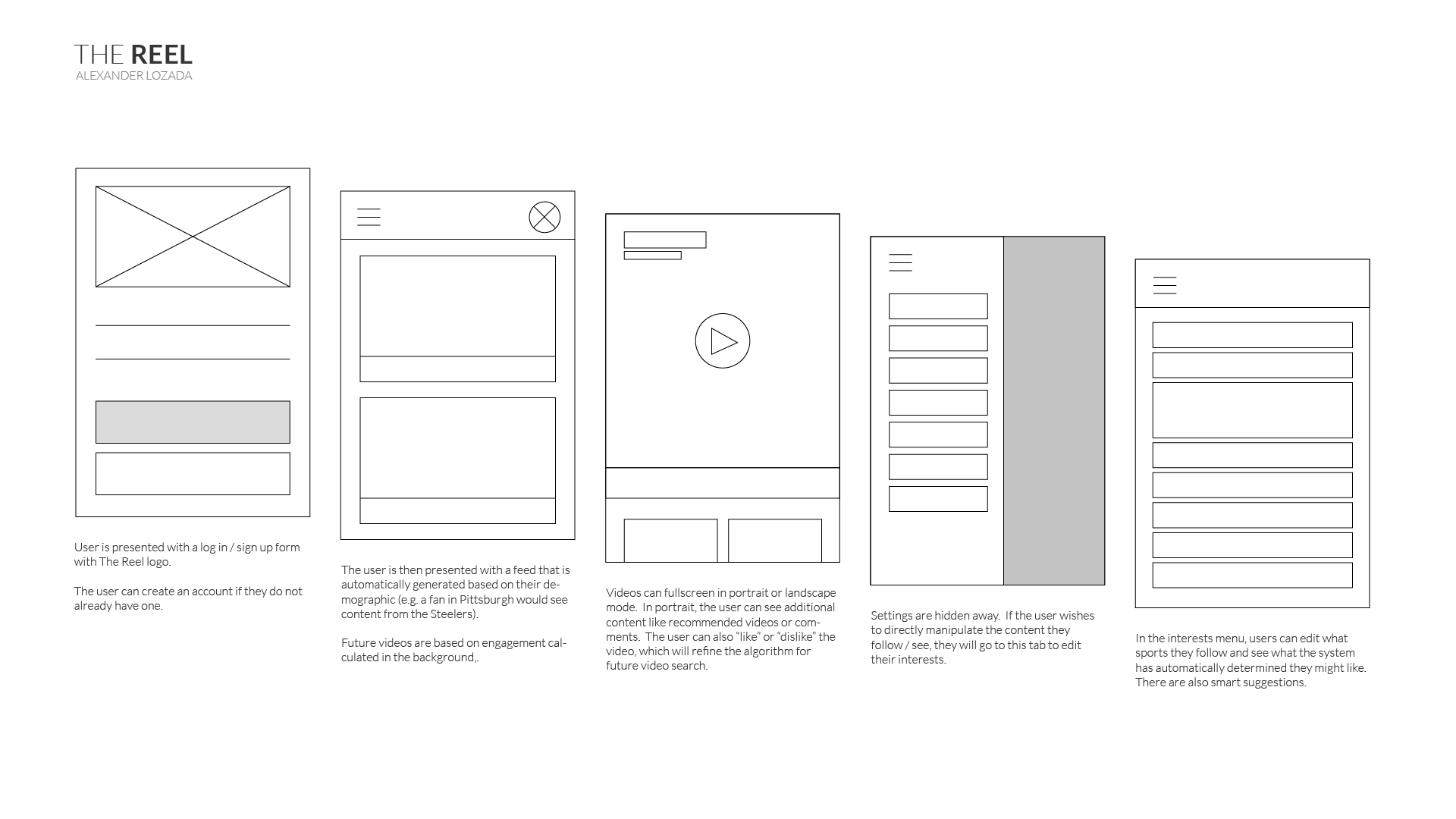
User flows are straightforward and simple. Users should be able to "sit back" and watch as many videos as they'd like without obtrusive interactions.
Today, I'd start with trying to understand this from a user perspective first. I could have interviewed some half-willing classmates at the time about how they use media today like YouTube, and more specifically sports and sports highlight videos. I could create a user journey and base the resulting wireframes on those flows. One other pattern to call out here is the use of the top-left hamburger menu. This control has lost favor to the easier-to-access-by-thumb bottom tab menu.
Styles
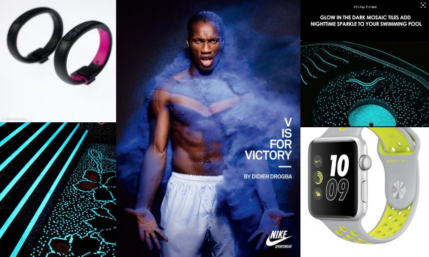
Styles are inspired by darker sports-related brands, particularly Nike's line. The general "trend" is composed of darker background colors accented with neon highlights. This app should feel sporty, after all. Competitive research on other similar products' look and feel would have helped here.
Signing Up
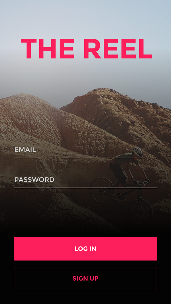
While users can sign up with traditional email addresses, signing in with Google or Facebook is also provided. Users can also use the application without signing in to experience the features before saving them to an account. It might look aesthetic, but that high contrast background image with light text is difficult to read. I'd recommend to my past self to stick with a solid background and ensure its accessible.
Gallery
Feed
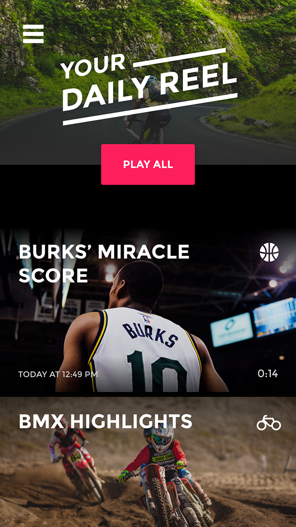
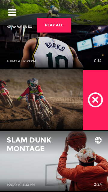
The feed is where the user should be spending 99% of their time. It's a content funnel. Each video is chosen algorithmically based on the user's location, primary language, interests and likes. The goal is to always provide one more video that piques the user's interest. I wouldn't actually want to build this product today. Entertainment shouldn't be addictive and users should ensure their time and privacy is respected. Don't be evil! Don't make engagement a game without the consent of the user (cases where that is useful is education applications, e.g. Duolingo). There's too many dark patterns already on social media to add more ways to keep people alienated in consumption.
Liking a video
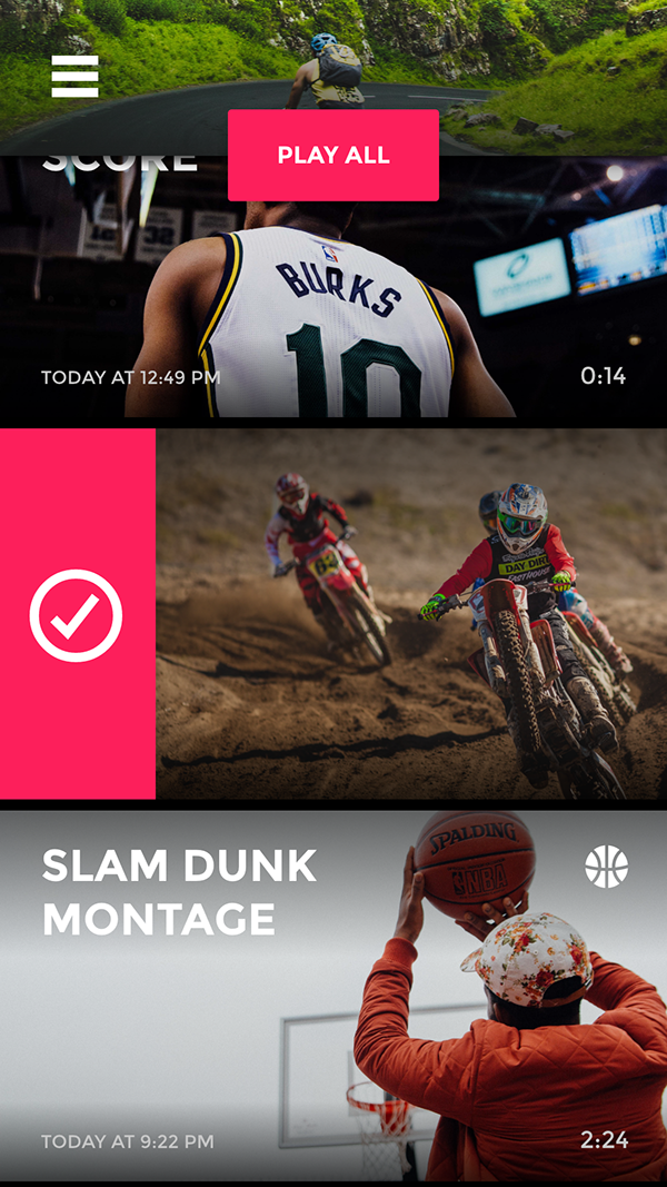
In order to provide a more granular control over shown content, the user can "like" a video. That video will be saved to their account to watch or share later. It will also help guide the home feed algorithm to display fitting content. It's a fun interaction, but it needs some affordance. Maybe a circle segment on the lefthand side, or a little "jump" animation that reveals there's an interaction.
Following topics
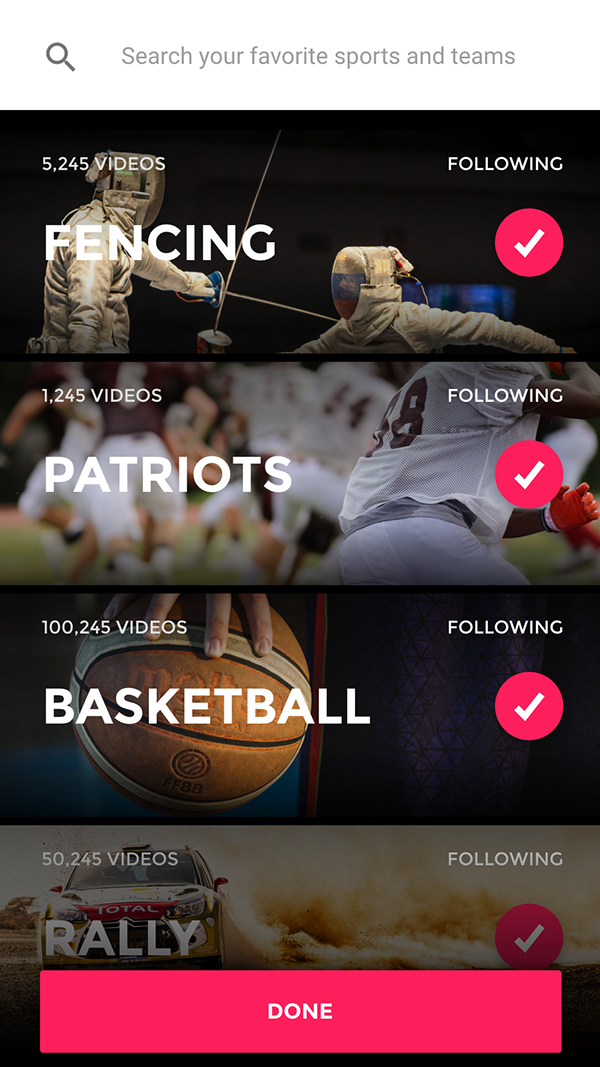
While anticipated automatically, users can manage their interests. They can search for specific sports, athletes, and networks to follow. Users can also unfollow suggested topics in this section. The dreaded hamburger menu strikes again... I also like the style of the search bar, but I'd bring it down to the bottom of the screen. I really like the Spotify pattern of double-tapping the search icon in the tab bar to autofocus the search input.
Stills
